Wednesday, November 13, 2013

Neon Sketchbook, Part II


Picking up where we left off two weeks ago, here is the second of two installments of neon sign sketches I made as part of the project that eventually became my book, New York Neon.  As those of you who saw Part I of this series may remember, none of these sketches ultimately made it into the book.  C'est la vie.  As it happens, I think the book came out fine without them.  But just so it wasn't a totally wasted effort, I thought I may just as well post them here on the blog. 

In Part I, we made the rounds of various liquor establishments, and admired those signs that contrast script and block letterforms.  Let's kick-off Part II at the movies:

ABOVE: Paramount Theatre, 560 Bay St., Stapleton, Staten Island (Gone); RKO Keith’s Theatre, 117-09 Hillside Ave., Richmond HIll, Queens; Variety Theatre, 110 Third Ave., Manhattan (gone); Earle (Eagle) Theater, 73-07 37th Road, Jackson Heights, Queens, made c.1939 (gone).

Sadly, New York City has almost no historic movie theater neon left in any of the five boroughs, though movie houses were one of the great bastions of neon signage for most of the midcentury decades.  The marquees depicted above were about all I could find to sketch when I began this project in 2006.  One of them - the Variety - was in fact already gone (I sketched it from good photos I found online).  The Earle (aka the Eagle) lost its marquee a few years ago, and the Paramount's marquee has unfortunately been altered beyond recognition.  The RKO Keith's was still there at last check, although - as you may have noticed - it's entirely incandescent, not neon.  

A paltry handful of vertical signs for old theaters survive, too:

ABOVE: Loews 175th, 4140 Broadway, Manhattan, made 1930 probably by Claude Neon/Strauss Sign Co.; Loews Coney Island, 1301 Surf Ave., Brooklyn, made c.1938 probably Claude Neon/Artkraft Strauss (gone); Loews Post Road, 3475 Boston Road, Bronx, made in 1939 by Artkraft Strauss; New Amsterdam Theatre, 214 W42nd Street, Manhattan, made in 1937 by Artkraft Strauss (altered 1955).

But these haven't fared well either:  the old SHORE sign didn't make it through Hurricane Sandy, and the Loew's POST ROAD and 175th Street signs are both relics in need of restoration.  Only the New Amsterdam Theatre sign on 42nd Street survives with a bill of good health.  This excludes, of course, for the Radio City Music Hall signs, which are well-enough documented that I skipped them for this exercise.  

So much for the movies.  This next bunch defies categorization, so we'll go into hodge-podge mode for the home stretch.  First, with some fascia signs:

ABOVE: Faber’s Fascination Arcade, 1230 Surf Ave., Brooklyn, made c.1948 by Silverescent (gone); Frank’s Fish Market, 4230 Broadway, Manhattan, made c.1949 (gone); Maryland Furniture Store, 911 East Tremont Ave., Bronx, made c.1957 by Grauer Sign Co.

Then, with some vertical signs:

ABOVE: E94th Street Garage, 231 E94th St., Manhattan, made c.1937; Barbetta Restaurant, 321 W46th Street, Manhattan, made in 1931; C.O. Bigelow Drugs, 414 6th Ave., Manhattan, made c.1938; Hinsch’s Confectionary; 8518 5th Ave., Brooklyn, made c.1948;  Hotel New Yorker, 481 Eighth Ave., Manhattan, made 1939-40; Keller Hotel, 150 Barrow St., Manhattan, made in 1933 by Beacon Sign Co.; Lascoff Drugs, 1209 Lexington Ave., Manhattan, made in 1931;
Nathan’s Famous, 1310 Surf Ave., Brooklyn, made c. 1930 Neergaard Drugs, 454 5th Ave., Brooklyn, made c.1950 by Silverescent; Veniero Pasticceria, 342 E11th Street, Manhattan, made c. 1945;


Truth be told, most of New York's surviving vintage neon is pretty modest compared to the old signs one finds in places like Los Angeles.  (I go into the reasons for this in the neon book.)  But we still have a handful of signs that are impressive works of the signpainter's skillful hand.  I've always been particularly drawn to the bold, distinctive silhouettes of swing signs, like these:

ABOVE: Crown Caterers, 4909 13th Ave., Brooklyn, made c.1949 (gone); Famous Oyster Bar, 842 7th Ave., Manhattan, made c.1960; M&M Pharmacy, 1901 Avenue M, Brooklyn, made c.1936; Theatre 80 St. Mark’s, 80 St. Mark’s Place, Manhattan; Village Vanguard, 178 7th Ave. South, Manhattan, made c.1945.

How amazing to think that this handful of signs represents an infinitesimal fragment of the many thousands of signs installed over the storefronts of New York during the glory years of electric signs.  As they continue to disappear, if nothing else, we'll have these sketches to remember them by.

IN OTHER NEON NEWS:

•  S&G Gross Loans by Penn Station appears to be undergoing its demi-centennial makeover: at last check, the porcelain enamel facade had been pulled off its 3-story facade, but the great vertical neon sign was still there. This is probably the city's most picturesque pawn shop of yore - here's hoping that neon survives.

•  Speaking of gross - some totally awful news from Yonkers (via Rob Yasinsac): Curry Chevy has completely destroyed its museum-piece dealership, including its great ensemble of neon.  This was hitherto a truly outstanding, 100% intact c.1958 car dealer.  What a goddamn shame.

•  If you're looking to brush up on your neon tube bending skills, look no further than neonstreet.com, which has recently updated its listing of neon schools nationwide.

•  Good news, for once (though not neon related) - the "Ideal Hosiery" building down on the Lower East Side has been landmarked.  Someone looked at the facade over that great signage and realized this building is a substantially intact 1833 row house.  Any changes to the signage will require the blessing of the Landmarks Commission - one wonders how the commission will interpret the significance of handpainted mid-20th century signage on a federal style residential building.

•  More neon (and other) treats from SoCal, via Debra Jane Seltzer.  Check out the San Fernando Relics Museum!

•  Good news from Greenpoint!  The Greenpointers neon documentary made its funding threshold and will be going into production.

•  From Jim and Karla Murray, a look at one of my favorite neon relics: the Berkeley Coats-Suits-Dresses sign in Brooklyn.

•  Enjoy a whole wagonload of other neon news links over at ProjectNeon.

Wednesday, November 6, 2013

Neon Short


I'm diverting from my scheduled post (which was to have been Part II of last week's post) in order to plug another NYNeon-type project I learned of recently: a 15 minute documentary film that will look at where the signs are made and how they fit into the identity of the city.  

Rosemary's Greenpoint Tavern. (Jen Galatioto)

Jen Galatioto over at thegreenpointers.com blog has launched a kickstarter online fundraiser to see the project through.  Their deadline is this coming Sunday (kickstarter requires a project to meet its target in order for it to receive funding).  The film would feature an interview with yours truly – obviously, this will be a blockbuster, if they get the funding!  Have a look and help them out (before Sunday) if you like what you see and you’ve got a few $$ to spare.

Regularly scheduled posts to resume next week.

IN OTHER NEON NEWS: 
 Looks like we're about to lose another one: Home of Cheers Liquors, at 18th and 8th in Chelsea, has apparently lost their lease.  

Home Of Cheers. (T. Rinaldi)

They're moving to 9th Ave - will their signs follow?


Wednesday, October 30, 2013

Neon Sketchbook, Part I

Among the more prominent scraps on my cutting room floor after finishing the neon book is a series of elevation sketches I made showing some of the signs that appear in the book. I first set out to sketch a few signs around town as a study of the unique silhouettes of their sheet metal sign faces.  For a crazy person like me, this turned out to be the slippery-slope down a long, dark road that ultimately led to my creating detailed elevation sketches for about 50 old signs found all over NYC.


The sketches began as simple silhouettes of the more distinctive old swing signs still hanging over New York sidewalks.  (T. Rinaldi)

My idea was to create a sort of HABS/HAER-type documentation of these signs as significant works of vernacular design, before they disappear.  I also thought that these little sketches might look good illustrating the endpapers of the neon book.  Short of traipsing all over town with my step ladder and measuring tape, I made these in CAD by tracing perspective-corrected photos.  So, if not quite accurate to a 32nd of an inch, these sketches at least provide something of a record beyond the photos in the  book.  

The drawings never made it into the book, so - here they are, out of the depths for your enjoyment and some measure of posterity, in two installments.  Stay tuned for Part II next week.

I have attempted to organize these by business type.  Let's start at the bars:


FROM TOP: Collins Bar, 735 8th Ave., Manhattan, made c1930;  Boulevard Tavern, 579 Meeker Ave., Brooklyn, made c1935; Farrell’s Bar & Grill, 215 Prospect Park West, Brooklyn, made c. 1935*; Fedora Restaurant, 239 W4th Street, Manhattan, made c1946; Minetta Tavern, 113 Macdougal St., Manhattan, made c1950; Old Town Bar, 45 E18th St., Manhattan, made 1937; White Horse Tavern, 567 Hudson St., Manhattan, made 1947 by the Allen Sign Co.; Rudy's Bar & Grill, 627 9th Ave., Manhattan, made 1937; Rocco Restaurant, 181 Thompson St., Manhattan, made 1934.

Still Thirsty?  We can always pick up more at these fine establishments:

FROM TOP: Casa Oliveira Wines and Liquors, 98 7th Ave. South, Manhattan, made 1935; Golden Rule Liquors, 457 Hudson St., Manhattan, made in 1934 possibly Neon Sign & Svc. Co.; Manley’s Liquors, 35 8th Ave., Manhattan, made c1934*; Mom’s Liquor Store, 2045 Richmond Terrace, Port Richmond, Staten Island, made c. 1935; Sterling Wines Liquors, 117 Smith St., Brooklyn, made c. 1935.  

Phew!  So much for the drinking establishments.  Let's go nurse that hangover with a little typography appreciation.  As previously noted on this blog, sign painters really enjoyed juxtaposing scripts with block letters.  I enjoy it too:

FROM TOP: Catania’s Shoe Shop, 3015 Westchester Ave., Bronx, made c1945 by Globe Neon; Garry Jewlers, 474 5th Ave., Brooklyn, made c1961*; Long Island Restaurant, 108 Atlantic Ave., Brooklyn, made c1953*; Morscher’s Pork Store, 5844 Catalpa Ave., Ridgewood, Queens, made c1950 (RIP); Patsy’s Restaurant, 236 W56th Street, Manhattan, made 1954 by Serota Sign Corp.;  Smith’s Bar, 701 8th Ave., Manhattan, made 1954 by DaNite Sign Co.

That's it for Part I. Stand by for more next week.....

As always, feel free to contact me with any questions.

IN OTHER NEON NEWS: 

 Speaking of cool elevation drawings of old neon signs - you can help restore the old neon marquee of the former Grauman's Chinese Theatre in LA, now in the collection of the Museum of Neon Art. 
From James and Karla Murray, a depressing then-and-now of the late great McHale's bar in Hell's Kitchen.  
 At Shorpy, an inspirational if vanished scene from Southington, CT.  
 Not nice (or entirely accurate) but worth a read: some anti-neon propaganda from the LED people.
Over at Project Neon, a nice write-up on the neon-festoond Kiosk of SoHo, apparently not long for this world. 

Wednesday, October 23, 2013

Long Island Restaurant

This past spring, the temporary disappearance of the spectacular neon signage advertising the Long Island Restaurant nearly incited a mild panic when the signs vanished from their perch at the corner of Henry St. and Atlantic Ave. in Brooklyn.   My heart, too, might have skipped a beat, but fortunately I had the inside scoop thanks to Toby Cecchini, one of the restaurateurs bringing the restaurant back to life, and Jeff Friedman of Let There Be Neon, where the signs were restored over the summer. 

Pre-Restoration: The corner of Henry and Atlantic in the winter of 2010. (T. Rinaldi)

The Long Island was a neighborhood anchor that operated from 1951 until 2007.  (Some background on the place can be found in this NYT story from a 2006.)  Many admired it as a survivor among survivors, replete with all kinds of details steadily vanishing from the urban landscape – especially its great triptych of neon signs.  When the place finally closed, most of us assumed it would all be lost forever. 

Pre-Restoration: The corner of Henry and Atlantic in the winter of 2010. (T. Rinaldi)

And it probably would have been, too, except that the family that ran the place also owns the building, and made preserving the space with all of its architectural details – and the signs – a stipulation of its lease agreement with any new tenant.  With that, the wheels went into motion.  It took a while, but the place finally re-opened last week under the management of restaurateurs Toby Cecchini and Joel Tompkins. 


Signs in the shop. (T. Rinaldi)

About the signs: city records tell us they went up in 1953, two years after the restaurant opened.  The sheet metal is all stainless – "a New York staple," says Tod Swormstedt of the American Sign Museum.  The design is simple: a particularly attractive script lettering juxtaposed against basic neon block letters, with the requisite round-topped "A".  My favorite detail: "Long Island" is abbreviated "LI" on the shorter side.  On the color scheme, I had never seen the signs lit; turns out they're cast in classic complementary shades of aqua and fluorescent red.  Unfortunately, there seems to be no record of which shop originally produced the signs.

Original letters alight again.  LTBN removed and cataloged each piece of glass while metal components were cleaned and re-assembled. (T. Rinaldi)

As for the restoration, after some initial sticker shock, the new management contemplated just leaving the signs in place un-lit.  Ultimately they decided to go whole-hog, having the signs taken down and given a ground-up rehab.  Let There Be Neon, who won the restoration contract, trucked the signs across the river to their TriBeCa shop for a thorough reconstruction.  Some great signs have been restored here in recent years, including those of Gringer Appliances, Russ & Daughters, and more recently the Beatrice Inn.

New electrodes spliced onto the original glass tubes (top). Salvaged tube segments awaiting refurbishment and repair (below). (T. Rinaldi) 

LTBN prescribed a complete rebuilding of the corroded angleiron framework beneath the stainless steel sheathing.  The stainless steel meanwhile had performed well, still in phenomenal shape after 60 years' exposure, so LTBN re-mounted the original stainless skin over a new aluminum framework.   First used as an architectural material at the Chrylser Building in 1931, stainless steel became a popular material for signs soon thereafter; incredibly durable but very expensive, it remained popular among sign makers until the 1960s, when anodized aluminum sheet metal caught on as a less costly alternative.  Stainless steel is almost never used for signs today.

American made: US Steel stamps still mark the concealed inside surface of the stainless cladding. (T. Rinaldi)

The backings within the channel letters were made of less costly, ordinary sheet metal, which was originally painted to match the color of the neon tubing housed within – common practice among sign makers of the period.  These components corroded over the years, leaving just a few traces of the historic green and red paint.  To leave the sign in its "as-found" appearance, LTBN opted not to re-paint the sheet metal backings, but instead to protect them as-is in a clear-coat finish. 

Traces of red paint (center) are preserved under a layer of WHAT.  (T. Rinaldi)

LTBN found most of the neon tubes still intact, but some were beyond salvage.  Color matching replacement neon tubes to the existing ones posed a problem: old tubes fade over time, particularly those lined with phosphorous coatings like these.  The options were: replace all of the tubes outright to achieve a uniform color match, or replace just the broken tubes and retain the intact ones.  In this case, the shop opted to replace as little as possible, keeping the existing tubes and fabricating new segments where necessary, though this required some delicate splicing of old and new glass tubes.   


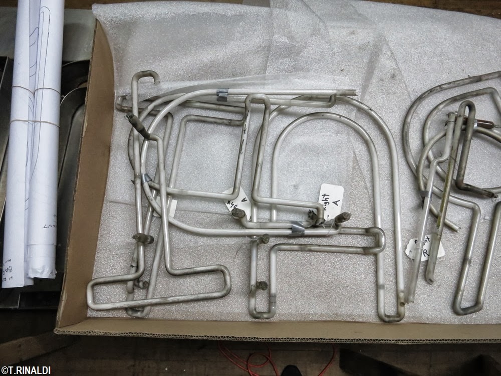
Veteran glass bender Ed Skrypa fabricating a replacement for one of the script "L"s.  (T. Rinaldi)

Look carefully at the sign today and you'll notice that some of the tubes shine more brightly than others: the new tubes, as one might expect, are brighter.  But like a fine patina, this slight imperfection is actually an indication of the authenticity of the sign as a whole, a metaphor for the contrast between new and old in the landscape at large that gives meaning to the very word authenticity. And as the new tubes age, the colors will even out over time.


Ed's tools (top); Salvaged glass fragments with hand-drawn patterns used to fabricate the missing segments.  (T. Rinaldi)

The Long Island Restaurant formally re-opened last Thursday.  The menu is beverages-only for now, but the kitchen will open later this year.  Meanwhile, the sign is up and running, so go out and have a look.  Then stay and raise a glass to a neon restoration brilliantly executed.  But that there were more like this.


Bright again: an artsy-blurred shot of the corner of Henry and Atlantic.  (T. Rinaldi)

Let There Be Neon salvaged existing tubes and spliced them to new tubes, as evidenced by the differential in brightness the tubes shown above. (T. Rinaldi)

"Long Island" abbreviated to script "LI" on the Henry Street side.  (T. Rinaldi)


Another view of the Henry Street elevation. (T. Rinaldi)


SEE ALSO: 
• Coverage of the LIRestaurant's resurrection in the Daily News...
• ...and in Eater. (Google for more.)
• JVNY's coverage of of the LIRestaurant revival from earlier this year.
• Artistic Neon's restoration of the great Circo's Pasticceria neon in Bushwyck, Brooklyn.

SPECIAL NOTE: 
• Back in the saddle:  after a hiatus, the NYNeon blog will resume regular posts for a few more months.

IN OTHER NEON NEWS: 
• From Debra Jane Seltzer, some recent blog posts full of west coast neon eye-candy, here and here.
• Also by way of Debra Jane, some pretty interesting neon archival photos digitized by the venerable Federal Heath sign co. of southern California.


Wednesday, September 18, 2013

Please Stand By

Please excuse the extended silence here at the New York Neon blog.  This is pretty much a one-man show and, as is wont to happen with such operations, I've had my hands full of late with some non-neon commitments.  The good news is that I have some good stuff in the pipeline, so "please stand by" for what I hope will be a nice run of posts to round-out 2013. 


“Indian-head test pattern” (Wikipedia)