Wednesday, October 23, 2013

Long Island Restaurant

This past spring, the temporary disappearance of the spectacular neon signage advertising the Long Island Restaurant nearly incited a mild panic when the signs vanished from their perch at the corner of Henry St. and Atlantic Ave. in Brooklyn.   My heart, too, might have skipped a beat, but fortunately I had the inside scoop thanks to Toby Cecchini, one of the restaurateurs bringing the restaurant back to life, and Jeff Friedman of Let There Be Neon, where the signs were restored over the summer. 

Pre-Restoration: The corner of Henry and Atlantic in the winter of 2010. (T. Rinaldi)

The Long Island was a neighborhood anchor that operated from 1951 until 2007.  (Some background on the place can be found in this NYT story from a 2006.)  Many admired it as a survivor among survivors, replete with all kinds of details steadily vanishing from the urban landscape – especially its great triptych of neon signs.  When the place finally closed, most of us assumed it would all be lost forever. 

Pre-Restoration: The corner of Henry and Atlantic in the winter of 2010. (T. Rinaldi)

And it probably would have been, too, except that the family that ran the place also owns the building, and made preserving the space with all of its architectural details – and the signs – a stipulation of its lease agreement with any new tenant.  With that, the wheels went into motion.  It took a while, but the place finally re-opened last week under the management of restaurateurs Toby Cecchini and Joel Tompkins. 


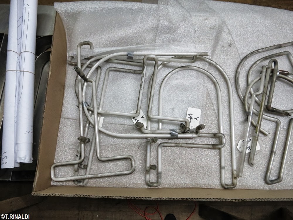
Signs in the shop. (T. Rinaldi)

About the signs: city records tell us they went up in 1953, two years after the restaurant opened.  The sheet metal is all stainless – "a New York staple," says Tod Swormstedt of the American Sign Museum.  The design is simple: a particularly attractive script lettering juxtaposed against basic neon block letters, with the requisite round-topped "A".  My favorite detail: "Long Island" is abbreviated "LI" on the shorter side.  On the color scheme, I had never seen the signs lit; turns out they're cast in classic complementary shades of aqua and fluorescent red.  Unfortunately, there seems to be no record of which shop originally produced the signs.

Original letters alight again.  LTBN removed and cataloged each piece of glass while metal components were cleaned and re-assembled. (T. Rinaldi)

As for the restoration, after some initial sticker shock, the new management contemplated just leaving the signs in place un-lit.  Ultimately they decided to go whole-hog, having the signs taken down and given a ground-up rehab.  Let There Be Neon, who won the restoration contract, trucked the signs across the river to their TriBeCa shop for a thorough reconstruction.  Some great signs have been restored here in recent years, including those of Gringer Appliances, Russ & Daughters, and more recently the Beatrice Inn.

New electrodes spliced onto the original glass tubes (top). Salvaged tube segments awaiting refurbishment and repair (below). (T. Rinaldi) 

LTBN prescribed a complete rebuilding of the corroded angleiron framework beneath the stainless steel sheathing.  The stainless steel meanwhile had performed well, still in phenomenal shape after 60 years' exposure, so LTBN re-mounted the original stainless skin over a new aluminum framework.   First used as an architectural material at the Chrylser Building in 1931, stainless steel became a popular material for signs soon thereafter; incredibly durable but very expensive, it remained popular among sign makers until the 1960s, when anodized aluminum sheet metal caught on as a less costly alternative.  Stainless steel is almost never used for signs today.

American made: US Steel stamps still mark the concealed inside surface of the stainless cladding. (T. Rinaldi)

The backings within the channel letters were made of less costly, ordinary sheet metal, which was originally painted to match the color of the neon tubing housed within – common practice among sign makers of the period.  These components corroded over the years, leaving just a few traces of the historic green and red paint.  To leave the sign in its "as-found" appearance, LTBN opted not to re-paint the sheet metal backings, but instead to protect them as-is in a clear-coat finish. 

Traces of red paint (center) are preserved under a layer of WHAT.  (T. Rinaldi)

LTBN found most of the neon tubes still intact, but some were beyond salvage.  Color matching replacement neon tubes to the existing ones posed a problem: old tubes fade over time, particularly those lined with phosphorous coatings like these.  The options were: replace all of the tubes outright to achieve a uniform color match, or replace just the broken tubes and retain the intact ones.  In this case, the shop opted to replace as little as possible, keeping the existing tubes and fabricating new segments where necessary, though this required some delicate splicing of old and new glass tubes.   


Veteran glass bender Ed Skrypa fabricating a replacement for one of the script "L"s.  (T. Rinaldi)

Look carefully at the sign today and you'll notice that some of the tubes shine more brightly than others: the new tubes, as one might expect, are brighter.  But like a fine patina, this slight imperfection is actually an indication of the authenticity of the sign as a whole, a metaphor for the contrast between new and old in the landscape at large that gives meaning to the very word authenticity. And as the new tubes age, the colors will even out over time.


Ed's tools (top); Salvaged glass fragments with hand-drawn patterns used to fabricate the missing segments.  (T. Rinaldi)

The Long Island Restaurant formally re-opened last Thursday.  The menu is beverages-only for now, but the kitchen will open later this year.  Meanwhile, the sign is up and running, so go out and have a look.  Then stay and raise a glass to a neon restoration brilliantly executed.  But that there were more like this.


Bright again: an artsy-blurred shot of the corner of Henry and Atlantic.  (T. Rinaldi)

Let There Be Neon salvaged existing tubes and spliced them to new tubes, as evidenced by the differential in brightness the tubes shown above. (T. Rinaldi)

"Long Island" abbreviated to script "LI" on the Henry Street side.  (T. Rinaldi)


Another view of the Henry Street elevation. (T. Rinaldi)


SEE ALSO: 
• Coverage of the LIRestaurant's resurrection in the Daily News...
• ...and in Eater. (Google for more.)
• JVNY's coverage of of the LIRestaurant revival from earlier this year.
• Artistic Neon's restoration of the great Circo's Pasticceria neon in Bushwyck, Brooklyn.

SPECIAL NOTE: 
• Back in the saddle:  after a hiatus, the NYNeon blog will resume regular posts for a few more months.

IN OTHER NEON NEWS: 
• From Debra Jane Seltzer, some recent blog posts full of west coast neon eye-candy, here and here.
• Also by way of Debra Jane, some pretty interesting neon archival photos digitized by the venerable Federal Heath sign co. of southern California.


Wednesday, September 18, 2013

Please Stand By

Please excuse the extended silence here at the New York Neon blog.  This is pretty much a one-man show and, as is wont to happen with such operations, I've had my hands full of late with some non-neon commitments.  The good news is that I have some good stuff in the pipeline, so "please stand by" for what I hope will be a nice run of posts to round-out 2013. 


“Indian-head test pattern” (Wikipedia)

Friday, August 23, 2013

San Fran Neon

San Francisco doesn't strike one as a city teeming with lots of great old neon.  LA, sure.  Vegas, maybe in the boneyard.  Debra Jane Seltzer, perhaps the most avid enthusiast of old signs I know, once told me that Chicago is her favorite city of neon.  I haven't been to Chi-town in a while, but for my money, San Francisco has an enviable concentration of fine vintage neon that most other towns (especially NYC) can only dream of.

Illuminated signs are a long-entrenched part of the San Fran skyline.  The signs are there in the backdrop of films like the Maltese Falcon (1941), Dark Passage (1947), Thieves Highway (1949), and Vertigo (1958). 


The Maltese Falcon (1941)

Beyond the cinematic record, the proof is still there to be seen on the city streets.  These are works of real character, dating mainly to the 1940s, '50s and '60s.  They boast novel sheet metal work, uniquely appealing pre-Helvetica letterforms, and a general quality of design that is notably more sophisticated than that of their surviving contemporaries here in New York.  What follows is a short photo essay of old signs I found in an afternoon walk around San Francisco back in 2007.  


Vertigo (1958)

Inasmuch as these old signs tell us anything about a city's quality of life, the preponderance of old signage in San Francisco is enough to make one wonder how such fragile parts of the landscape seem more apt to survive in some places than others, both at the micro-level – from one neighborhood to the next – and a macro level, between cities.  At one point, common wisdom associated old neon signs with urban decay and stagnation.  Now, however, they're more often prized for their association with old, independent businesses that serve as anchors of stability for their respective neighborhoods.  What do all these old signs tell us about San Francisco?  What does their absence tell us about those places – New York and elsewhere – where such things just can't seem to survive?   

George’s Market / 702 14th Street

Harrington Bar & Grill / 245 Front Street

 Hotel St. Paul / 931 Kearny Street

 Mr Bing’s Cocktail Lounge / 201 Columbus Avenue  

Tosca Café / 242 Columbus Avenue

Royal Pacific Motor Inn / 661 Broadway 

La Pantera Café / 1234 Grant Avenue

Stella Pastry / 446 Columbus Avenue 

Tony Nik’s Café / 1534 Stockton Street

Columbus Café, Gino and Carlo / 562 Green Street

Sodini’s Restaurant / 510 Green Street

New Rex Hotel / 407 Broadway

SEE ALSO: 
Via Shorpy, a colorful scene from the heyday of San Fran neon.

Thursday, August 15, 2013

Hotel Neon: The St. James Hotel


To look at it now, you'd never suspect the St. James Hotel (off Times Square) of having once been the quintessential seedy "transients" dive.  Unless you know that such was the state of most old hotels in this part of town through the 70s, 80s and 90s, when weathered neon signs seemed to hang over their entryways on every midtown sidestreet.


All's quiet on West 45th: the St. James today. (T. Rinaldi)

Neon HOTEL signs hung from the old brick façade of the St. James until fairly recently, finally coming down about ten years ago.  This particular signage was recognizable for having appeared in not one but two films, in which the St. James played the role of the gritty, down-and-out flophouse from central casting.  Director William Friedkin used the St. James in his 1980 film "Cruising," a psycho-sexual thriller about a serial killer on the loose in New York's then still rather ribald gay bars.  Not ten minutes into the movie, the St. James' old neon sign portends a brutal slaying soon to play out in a cheap room upstairs.     

   
The. St. James in its gritty heyday. (Cruising)

The same sign makes another cameo in director Penny Marshall's 1988 film Big, starring Tom Hanks.  After eleven-year-old Josh Baskin is rendered unrecognizable in the body of a grown man, he and a school chum make their way to New York, where they eventually wind up at Times Square in search of a cheap hotel.  "You lookin' for some fun tonight sweet thing?"  "No thank you."  After negotiating streets of beggars, prostitutes and wandering schizophrenics, they finally find themselves bathed in that familiar glow.  "Hey, this looks OK," reassures Josh's friend.  The camera pans up toward the that same old sign.  "No it doesn't!" comes Josh's desperate reply.


(Big) 

Hollywood's unflattering characterizations of the St. James were not without basis, at least if one is to judge by a write-up that appeared in the New York Times under the headline "Shadows Near the Bright Lights," one year before the release of "Big."   Times writer David Pitt detailed tough times at the St. James and its neighbor, the Normandie, both of which by then had joined the ranks of the city's Single Room Occupancy, hard-knocks hotels.

"The day clerk at the St. James, who asked that his name not be used, acknowledged that prostitutes routinely try to bring customers upstairs. But he said he always did his best to keep them out, sometimes with the aid of a baseball bat.  'Sometimes a hooker will sneak by me,' he said from behind his desk-to-ceiling bulletproof canopy. 'But look, I don't know who is and who isn't. How am I supposed to know? They go into the Plaza, too, but who stops those girls?'


Checking in. (Big)

"'Now drugs - that I won't allow,' he said, reaching under the counter to display his Louisville Slugger, a Fred Lynn autograph model. 'I see drugs, I say Mr. or Mrs., out you go.'"  Mr. Pitt also scored some choice quotes from the hotel's night clerk:  "'See where the glass is broken?' he asked. 'We wouldn't let this guy in the other night, so he kicked in the door. That kind of pimp, they're the worst - filthy, dirty, living on crack. Your regular pimp is usually clean... These are lowlifes.'"


Photographer Guy Mansuco caught this great photo of the St. James sign just before it disappeared.  (Guy Mansuco)

The St. James' old neon signs hung in there all the way through the Times Square ball drop that rung in the new millennium.  They finally came down a few years later, apparently around the time the St. James picked itself up, shook itself off, and re-opened as a more tourist-friendly hostelry.  Today the pimps and the lowlifes seem to have checked out:  the St. James gets decent reviews at yelp.com, though one visitor, a certain Karla P. from Encinitas, California, complains that the management still uses "actual metal keys" rather than electronic card readers for room access.  The neon may be gone, but the old St. James lumbers on, its checkered past now safely pickled in celluloid. 

(T. Rinaldi) 


THIS IS THE SIXTH in a series of stories entitled "Hotel Neon," exploring the unique resonance of neon hotel signs in the American psyche. See also: 


IN OTHER NEON NEWS:

• Via the Lost City blog, D'Aiuto Pastry closed this past Sunday (8/11/2013), supposedly for "renovations."  This does not bode well for that fantastic sign...

• From DNAInfo: some serious backpedaling from our friends at U-Haul, after their erasure of Brooklyn's landmark Eagle Clothes sign in Gowanus.

Thursday, August 1, 2013

Cab Call Decoded and The Utah House's Neon Epilog

After my May 30, 2013 post on the former Utah House in Chelsea, friend and reader T.R. Revella did what didn't occur to me, and looked up the corner of 25th and 8th in the Percy Loomis Sperr photographs over at the NYPL to see what was going on at this corner in the 1930s.  Photographs dated March 21, 1938 show the storefront occupied by a certain V. Protopapas Pharmacy.  Like most drug stores of that period, Protopapas had a handsome little neon swing sign dangling over the corner, advertising "DRUGS" and "SODA". 


In writing on the Utah House and its ancient, hand-painted sign, revealed in the midst of a storefront renovation, I hoped that this relic might be covered over in plywood and entombed to one day reveal itself again.  Sadly, the sign has since been destroyed.  The storefront's new occupant, the Market Cafe, had the brownstone lintels slathered in black, Karnak-like crap.  So much for that.


(T. Rinaldi)

Asked and answered:  my post on the St. Regis Hotel's lovely and mysterious "Cab Call" sign had hardly merged onto the information superhighway when an e-mail came in from architect Rick Zimmerman.  "Many, if not all of those cab calls were made by the now defunct Kliegl Bros., makers of much theatrical lighting equipment," he writes.  Mr. Zimmerman directed me to old Kliegl catalogs, scanned versions of which can be viewed online at klieglbros.com.  The catalogs will delight any enthusiast of old signs.


(Kliegl Bros.)

Cab Call signs appear in Kliegl catalogs from 1913 through as late as 1936, in pretty much the exact form as the one over at the St. Regis. Kliegl's product lit describes them as "a rapid, quiet and effective means of calling vehicles to doorways of theatres, hotels, department stores, and other public buildings."  The signs were "constructed entirely of metal" and made up of "three numbers placed together in one frame. . . . Each number is distinctly outlined by incandescent lamps and can be seen clearly by day as well as by night." 


(Kliegl Bros.)


In the post, I speculated on how exactly they worked.  Says Kliegl Bros: "One special constructed switch which is operated without inserting a card or other contrivance, by simply operating the numbers, units, tens and hundreds on handle and pressing the handle inward, makes the correct connections quickly. . . . Any printed card with numbers can be given patrons, so that on return of same, the proper carriage can be called by attendant."  In other words, sort of like the take-a-number system over at the DMV.  Mystery solved!

Many thanks to T.R. Revella and Rick Zimmerman for writing in with these helpful hints.

IN OTHER NEON NEWS: 

• Another one gone:  The Charles St. Garage sign (featured in the neon book) has been replaced by this glamour girl:

• Charles St. may have lost its neon, but St. Charles still has its – from James and Karla Murray, an absolutely gorgeous photo of the St. Charles Garage "for Transients" over on East 60th Street.

• A painful loss on the horizon: the Back Fence, on Bleecker, set to close in the coming weeks.  

(T. Rinaldi)

• Much as I hate to be the bearer of really sh*tty news ... the rest of Hinsch's neon seems to have come down, "for repairs."  Don't hold your breath.  Thanks to Debra Jane Seltzer for the link.

• Speculation on the future of the Watchtower sign in Brooklyn Heights.  

• Not all news is bad news: via Rolando Pujol, Riverside Liquors is up and running again, along with its great old sign, on the Upper West Side.  Welcome back guys!


(Rolando Pujol's instagram)

• Check out this really great write-up on New York Neon over at The Bowery Boys blog!

• A great shot of The Hub in the Bronx, c. 1940, in all its neon glory, via Shorpy.

• Also via Shorpy, feast your eyes on Jamaica, Queens, here absolutely dripping in neon storefront signs in 1944.

• And yet another one from Shorpy – a wonderland of suburban neon out in Smithtown, Long Island, 1954.

• By way of Rob Yasinsac, another upstate loss, at the Peekskill Inn overlooking the Hudson in Peekskill.


The Inn on the Hudson, nee the Peekskill Inn. (T. Rinaldi, above, Rob Yasinsac, below).       

• From Tom over at Krypton Neon: a very promising trailer for a very promising new doc called "Signpainter," based on the recently-released book by the same name.

• Not neon, but of the same ilk: Jeremiah's Vanishing New York reports that the now-shuttered Elk Hotel's "Entrance on 42nd Street" signage, a relic of seedy Times Square hiding in plain sight at 43rd and 9th, is now hiding somewhere else.


(T. Rinaldi)
  
• Way out of the tristate, but neon news nonetheless – some spectacular Pontiac dealer signage "gone the way of the Pontiac" in Orlando, Florida. 

• A great roundup of old Boston signage (neon and otherwise) at this tumblr page.

• And finally, a last bit of unhappy news: RIP to Big Nick's on the upper west side, which had one of my favorite neon window signs in town.  

(T. Rinaldi)